Disneyland App
Reimagining Genie+ in the Disneyland app so first-time visitors can actually use the Lightning Lane reservations they paid for.
For fans of Disney films and characters, a trip to the parks is a dream come true. To help visitors make the most of a day at "the happiest place on earth," Disney added the Disney Genie service to the Disneyland app. Visitors can also buy Genie+, a paid add-on that unlocks Lightning Lane ride reservations and professional PhotoPass photos.
Paying for Genie+ doesn't mean you'll know how to use it. I interviewed recent Genie+ buyers, mapped the app's information architecture, and redesigned the home screen and map so booking a Lightning Lane is obvious, then tested the prototype with users.
Jesse paid for Genie+ and never used it
Jesse was visiting from out of state for her first time at the Disneyland parks, with three solo days of fun planned. She'd never used Genie, Genie+ or the Lightning Lane system before, and after buying Genie+ she couldn't work out how to use it. The app was full of information but offered no clear guide to its features. With little direction and too many things to tap, Jesse never used the services her Genie+ pass promised, and left disappointed.
How can the current Disneyland app be reimagined for a more intuitive mobile experience?
I focused on three of Nielsen's usability heuristics:
- Visibility of system status: show visitors where their plans stand and when they can book next.
- Match between system and the real world: use words and visuals visitors recognize, not internal Disney terms.
- Consistency and standards: make the same task work the same way everywhere in the app.
Six recent Genie+ buyers, three kinds of visitor
The app's main users are fans visiting Disneyland and Disney California Adventure in Anaheim, CA, who may add Genie+ to their tickets. I interviewed 6 people who had recently visited and bought Genie+, to understand how they thought and felt about the Genie+ and Lightning Lane process. Three personas came out of it:
-
 Fresh new visitor
William is visiting from out of state and has never been to the Disney parks.
Fresh new visitor
William is visiting from out of state and has never been to the Disney parks.
-
 Occasional park visitor
Rebecca and Kelsie are California residents who enjoy the magic and the rides once a year.
Occasional park visitor
Rebecca and Kelsie are California residents who enjoy the magic and the rides once a year.
-
 Frequent annual passholder
Melissa and Justine love experiencing every part of the parks and visit about once a month.
Frequent annual passholder
Melissa and Justine love experiencing every part of the parks and visit about once a month.
Finding the redundancy first
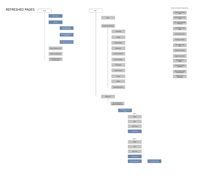
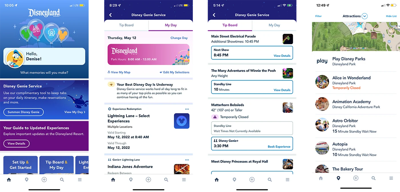
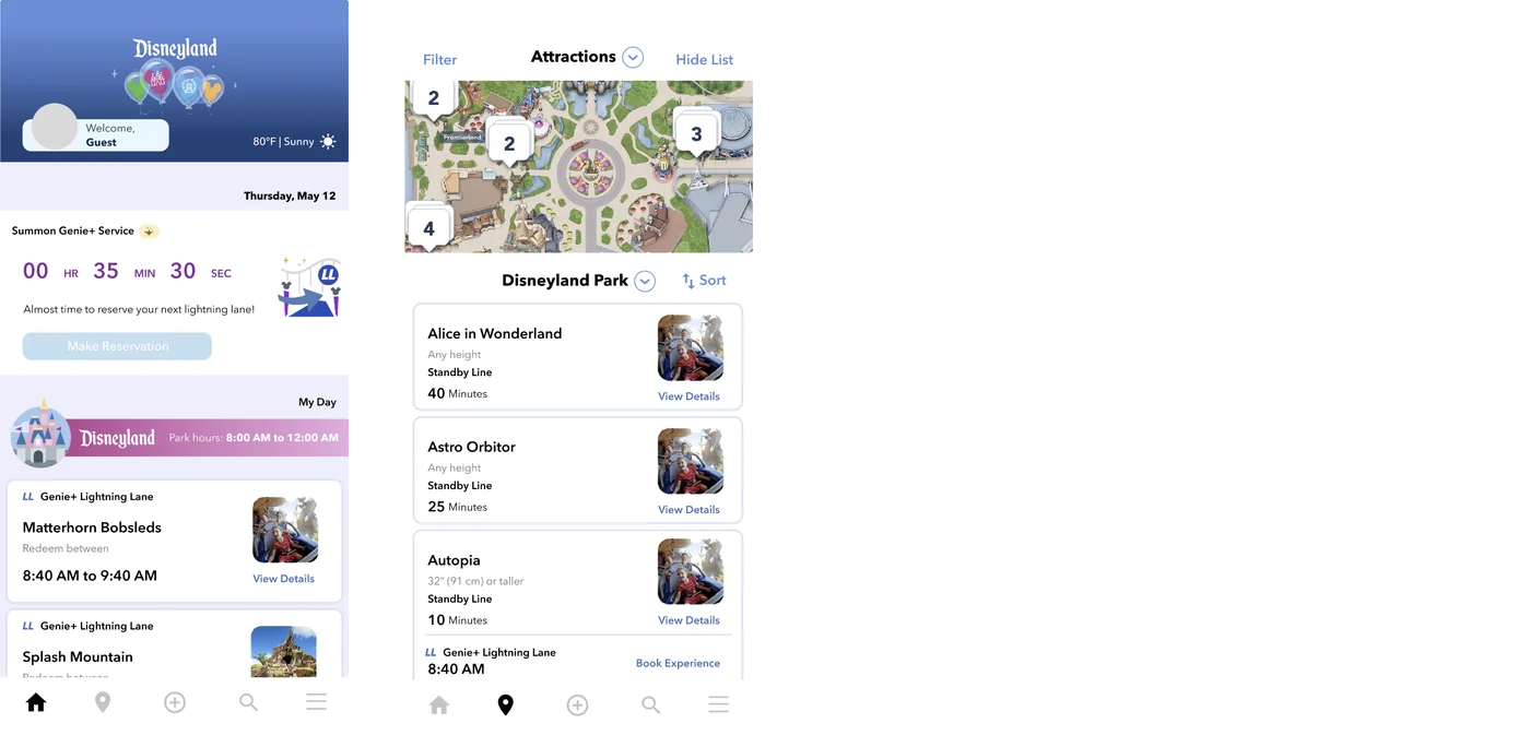
Inspired by Jesse's experience, I started by listing the pain points in the Genie+ service and working out why the current design didn't work. Then I mapped the app's information architecture to see where pages repeated each other and what could be cut.
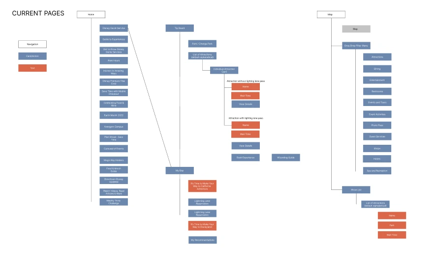
Before · 4 screens
After · 2 screens
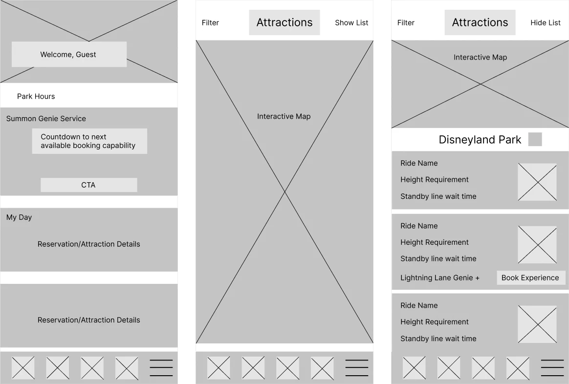
With the new structure in place, I sketched wireframes and drafted prototypes, adjusting the information hierarchy and the keywords on each card so visitors could get what they need at a glance while they're in the park.
Three insights, three changes
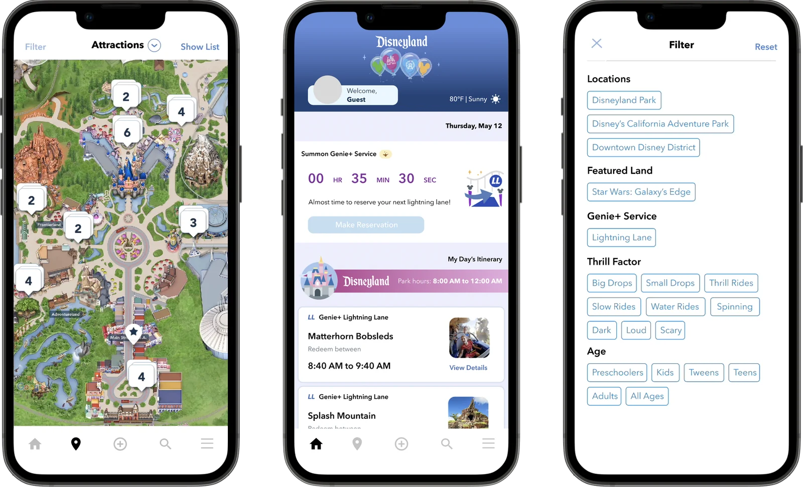
The reimagined main page brings the changes together. It answers what a visitor needs to know in the park, in the order they need it.
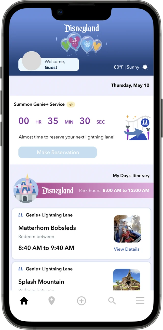
- WeatherUpdated temperature and conditions, to plan what to bring for the day.
- Countdown timerA real-time timer showing when the next reservation can be made.
- Park hoursHours of operation, clearly displayed.
- ItineraryBooked reservations shown as cards, in chronological order.
01 Put booking on the home screen
Insight: after buying Genie+, people struggled to understand how it worked. Features went unused or caused frustration.
Change: I moved My Day onto the home screen with a single call to action for booking Lightning Lane reservations. Genie+ has several rules about how often you can book, so a countdown timer shows exactly when the next reservation opens. The rest of the information was reorganized to cut clutter.

02 Teach the vocabulary visually
Insight: visitors have to learn Disney-specific terms before they arrive. New and occasional visitors didn't realize Lightning Lane reservations come with Genie+.
Change: the home screen pairs a clear Lightning Lane mark with the words, so the connection is visible. Every reservation card is labeled Genie+ Lightning Lane.
03 Move the Tip Board into the map
Insight: visitors didn't know ride names, so they often opened the map to find out more.
Change: I moved the Tip Board into the map, which makes the map more useful and removes a duplicate page. Rides can be filtered by Lightning Lane availability, wait times and location.

One way to book became three
I asked users to book a Lightning Lane reservation in my prototype. They were excited by the refreshed design, especially the countdown and its guidance on when to book next. The original app had one flow for booking a reservation. My redesign offers three, from different parts of the app, and users appreciated the flexibility and the clear wording that helped them finish booking.
If it worked at scale, the redesign could mean happier days in the park, more visitors buying Genie+ again, and a higher Net Promoter Score.
This project taught me to analyze an existing app's information architecture and find ways to cut pages, so people take fewer steps to finish a task.