Truffle Health
A new website, design system and bill-review flow for a New York healthtech startup that helps patients make sense of their medical bills.
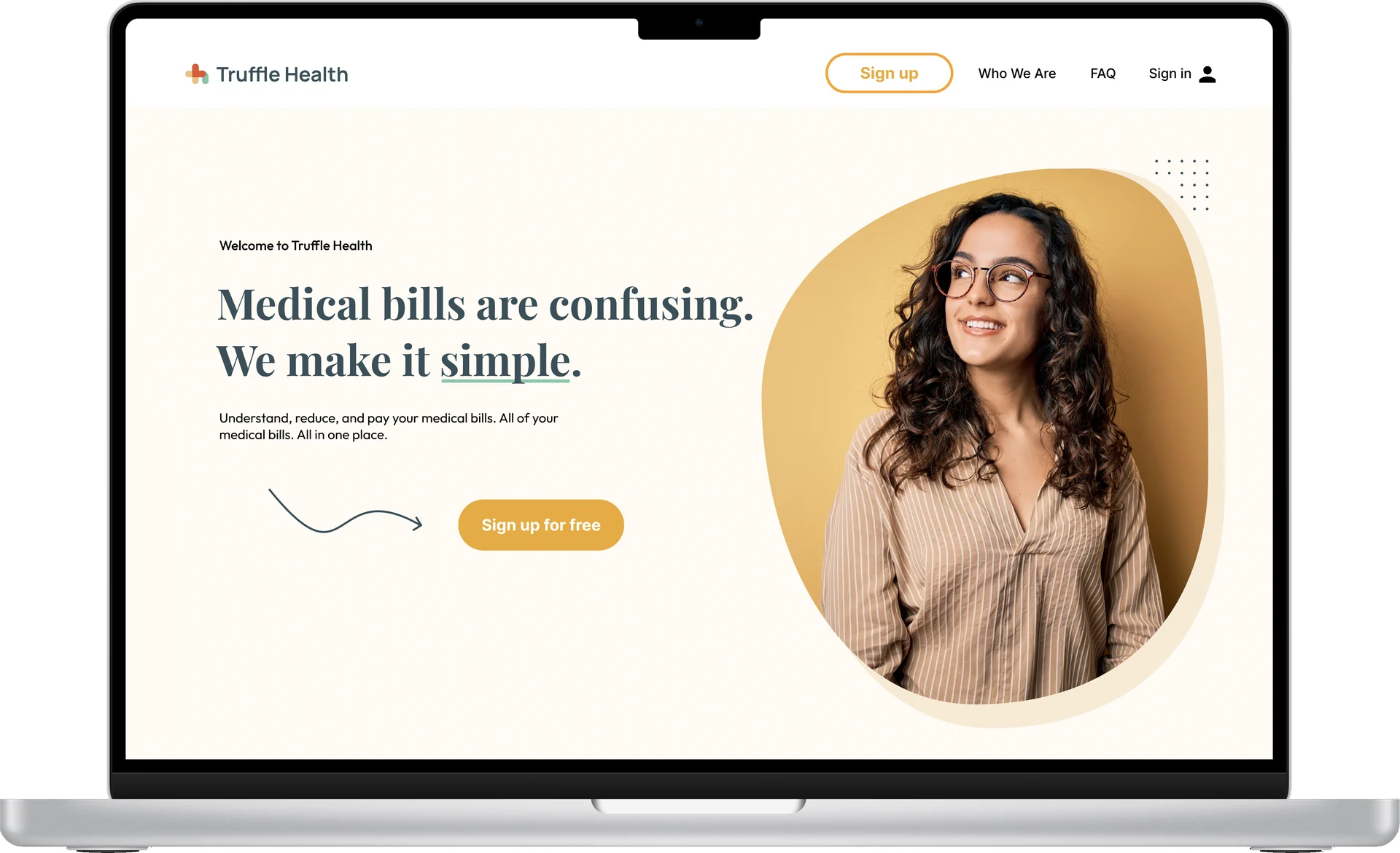
Truffle Health is a New York healthtech startup, often called the TurboTax for medical bills. It helps patients organize, understand and reduce their medical bills, going after a $100 billion problem: fraud and errors in US medical billing.
As the Product Designer, I redesigned the landing page and supporting pages so they showed Truffle's mission to help patients, and I created the design system the production site and web app were built on. I also designed the bill-review flow that walks a patient through an itemized bill, one possible error at a time.
The new site went live weeks after kickoff and became Truffle's highest-converting landing page.
Making medical bills less intimidating
Truffle's users are people with health insurance who get a medical bill they can't make sense of. The codes are unreadable, and it's hard to tell whether a charge is wrong, let alone what to do about it. Healthcare and billing products tend to make this worse with a confusing, sterile experience. We wanted Truffle to feel friendly and welcoming instead.
With the Head of Product and the CEO, I set three goals before any lo-fi mockups:
- Welcome patients. Make a landing page that speaks to the pain points of someone holding a medical bill.
- Explain it simply. Describe the product, in pictures and in words, so any patient could understand it.
- Encourage sign-ups. Get visitors to press Sign Up, with high click-through and sign-up conversion.
40+ interviews across the whole journey
With the product team, we ran 40+ interviews with patients, patient advocates and potential users. Some interviews followed the full journey, from the website to sign-up to the web app dashboard. We used them to map user journeys and to learn how people felt about different designs. I also studied 20+ healthcare competitors and leaders to understand the market.
During and after research, I worked with the Head of Product and the CEO on journey maps from first visit to the end product. At the highest level, a patient's path looked like this:
- Discover
landing page, FAQ, about - Sign up
join and create an account - Connect
link insurance and provider portals - Dashboard
every bill in one place - Review
check each bill for errors - Resolve
correct, negotiate or pay
Three choices that shaped the redesign
01 Warm, earthy colors
I built the design system over several iterations. Instead of the heavy blues and purples most healthcare apps use, it uses warm, earthy tones, which patients described as positive and welcoming. Soft shapes and fonts, plus playful imagery and icons, make it feel friendly and approachable. Both the production site and the web app were built on it.
- Cream
#FCF8F2Page background - Honey
#E4A844Primary actions - Slate
#384C58Headlines and text - Sage
#88C4A8Accents and confirmations - Terracotta
#D45C38Logo and highlights
02 Leading with how patients feel
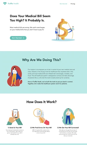
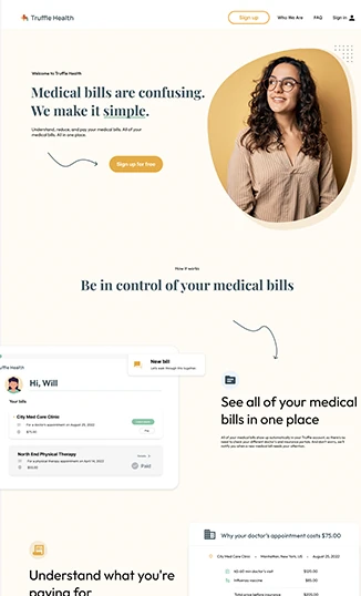
The old site opened by asking whether your bill seemed too high, followed by long blocks of text on teal. The new hero names the feeling first, "Medical bills are confusing," makes one promise, "We make it simple," and offers one clear next step: Sign up for free.
Before
After
03 Showing the real product
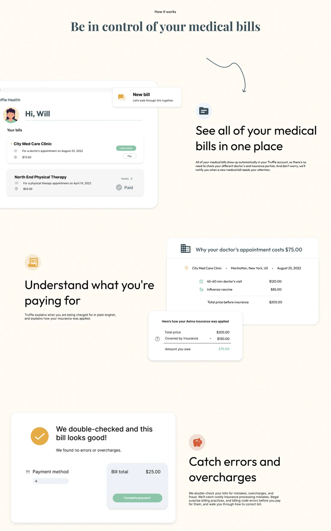
The old "How does it work?" section used three illustrations to describe the service. The new one shows the real product: every medical bill in one place, a plain-English breakdown of what you're paying for and how your insurance was applied, and a check that catches errors and overcharges. Patients see what they'll get before they sign up.
Turning an itemized bill into a checklist anyone can follow
Inside the web app, I designed the flow that walks a patient through an itemized bill. It starts by translating every billing (CPT) code into plain English and showing how insurance was applied. Then it checks for one kind of error at a time, explains each one in everyday words, and only asks the patient questions they can answer, like which services they never received or how long their visit really was.
- Phantom charges
- Charges for services you didn't receive. You tick anything you didn't get.
- Duplicate charges
- The same service billed more than once.
- Inflated charges
- Prices far above the average cost of the same service across many providers.
- Upcoding
- Billed as more severe, and more expensive, than the care you got. You choose how long your visit actually was.
- Unbundling
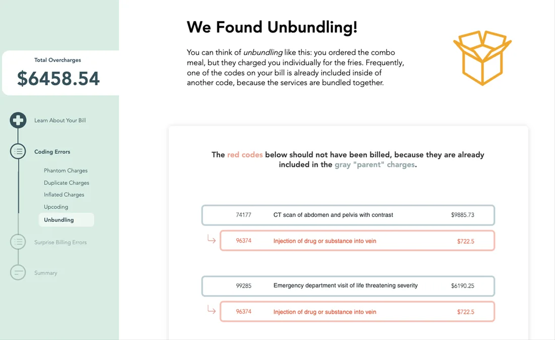
- "You ordered the combo meal, but they charged you individually for the fries."
- Surprise billing
- Out-of-network charges you didn't know about, now limited by the No Surprises Act.

The summary adds up the overcharges by type, and each one has a Fix it path: a cheat sheet that explains which codes shouldn't be on the bill, tells the patient to call their insurer and push for a corrected bill, and what to do if that doesn't work.
v2 From a progress bar to a running total
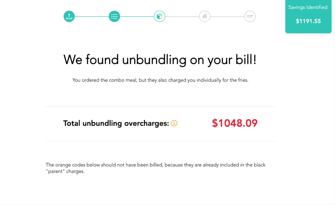
My first version, in July, used a five-step progress bar across the top, with the savings found so far tucked into a corner badge. By September, I'd moved navigation into a sidebar that lists every check under its group and keeps the Total Overcharges in view. Patients can always see where they are, what's left, and how much they've found.
July · v1
September · v2
From Wix limits to our own servers, live in weeks
I worked with product and engineering for two weeks, iterating on production versions of the designs while engineering built the new site. My original designs had to fit within the limits of Truffle's Wix site. Then engineering moved the entire app onto our own servers, which removed them. The new site went live weeks after the project kicked off.
Truffle's highest-converting landing page
The redesigned landing page became Truffle's highest-converting page for getting patients to sign up, so they could organize, understand and save up to thousands on their medical bills. The design system went beyond the website and shaped the web app too.