Kessel Run · Jigsaw
Designing a Map View so the Air Force's tanker planners could see a route, edit it and trust the fuel math without leaving the app.
Kessel Run is a 1,000-person software company inside the U.S. Air Force. My team designed and built Jigsaw, one of its core cloud applications, for the airmen who plan tanker refueling missions: tasking a tanker aircraft to refuel another aircraft mid-flight. The goal is that no aircraft ever falls out of the sky because it ran out of fuel.
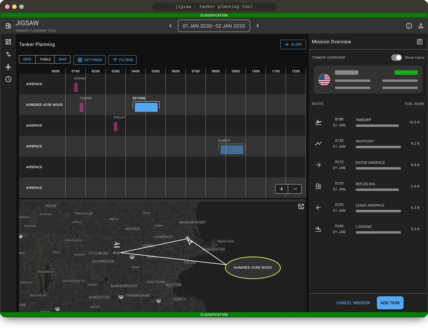
Planners were leaving Jigsaw for outside map tools and working out fuel by hand. I led the design of the Map View from the ground up: an interactive map that shows a tanker's route and airspaces, lets planners reshape it with waypoints and recalculates fuel as they go. It's now used by every airman who plans missions in Jigsaw.
Where refueling fits in the mission cycle
The Air Force is divided into geographic areas of responsibility, each with Air Operations Centers. Inside them, the Combat Plans Division owns the "Plan" part of the mission cycle. Planners there receive an objectives brief, with risk analysis, targets, asset allocation and weather, and turn it into missions for Air Force units to fly.
- Objectives & guidance
- Target development
- Capabilities analysis
- ATO production
- Execution
- Assessment
There are many mission types, including reconnaissance, attack and refueling. Jigsaw focuses on refueling. Tankers are aircraft that carry large amounts of fuel and can refuel other aircraft in the air. Jigsaw's core users, tanker planners, make sure every aircraft that requests refueling is supported by a tanker, and that the tanker pilots get plans that are viable and efficient.
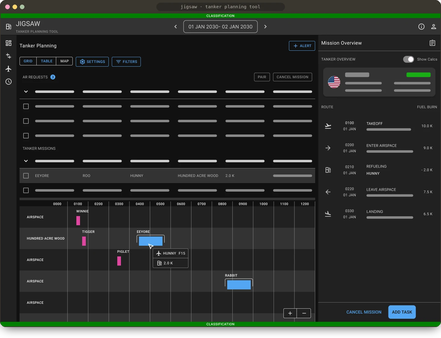
Before the Map View, Jigsaw offered two ways to see mission data. A table view held refueling requests, aircraft, fuel calculations and airspaces. A grid view, a Gantt chart with time across and airspaces down, showed which tankers and receivers were paired when. A split view put both on one page.
What planners still couldn't see
Our research showed Jigsaw already answered three important questions well: which tankers are available, how much fuel they have, and which airspaces are open for refueling. But planners still couldn't answer the questions that come next:
- Where are these refueling airspaces?
- Can the tanker make it round-trip to them safely?
- What is the tanker's actual route?
- Are the fuel calculations trustworthy?
- Can a mission be created quickly?
That left planners with three main pain points:
- Spatial information was hard to read. To understand airspace coordinates, planners often turned to an outside, unsecured mapping tool.
- Mission metrics were missing. Without calculated distances and fuel, planners estimated by hand.
- It didn't scale. When mission volume spiked, time went to validating route calculations with pilots.
Learning how planners work
Our users have demanding, highly technical jobs, and I had to learn the domain quickly while iterating on designs. I ran monthly remote interviews and, with our PM and tech lead, spent three days on-site with the tanker planning team, watching their process from start to finish. When the moment was right, we sat with planners at their desks to dig into specific pain points and why they worked the way they did. We spoke with airmen of every rank from Tech Sergeant to Captain, and documented the workflows in Kessel Run's shared research library so other teams could build on them.
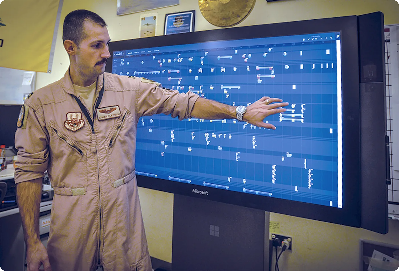
Expectations were part of the design problem too. Planners were used to legacy systems whose complicated UI made the learning curve steep every time a new rotation of airmen arrived, and workflows varied from planner to planner. I had to understand those habits without simply rebuilding them.
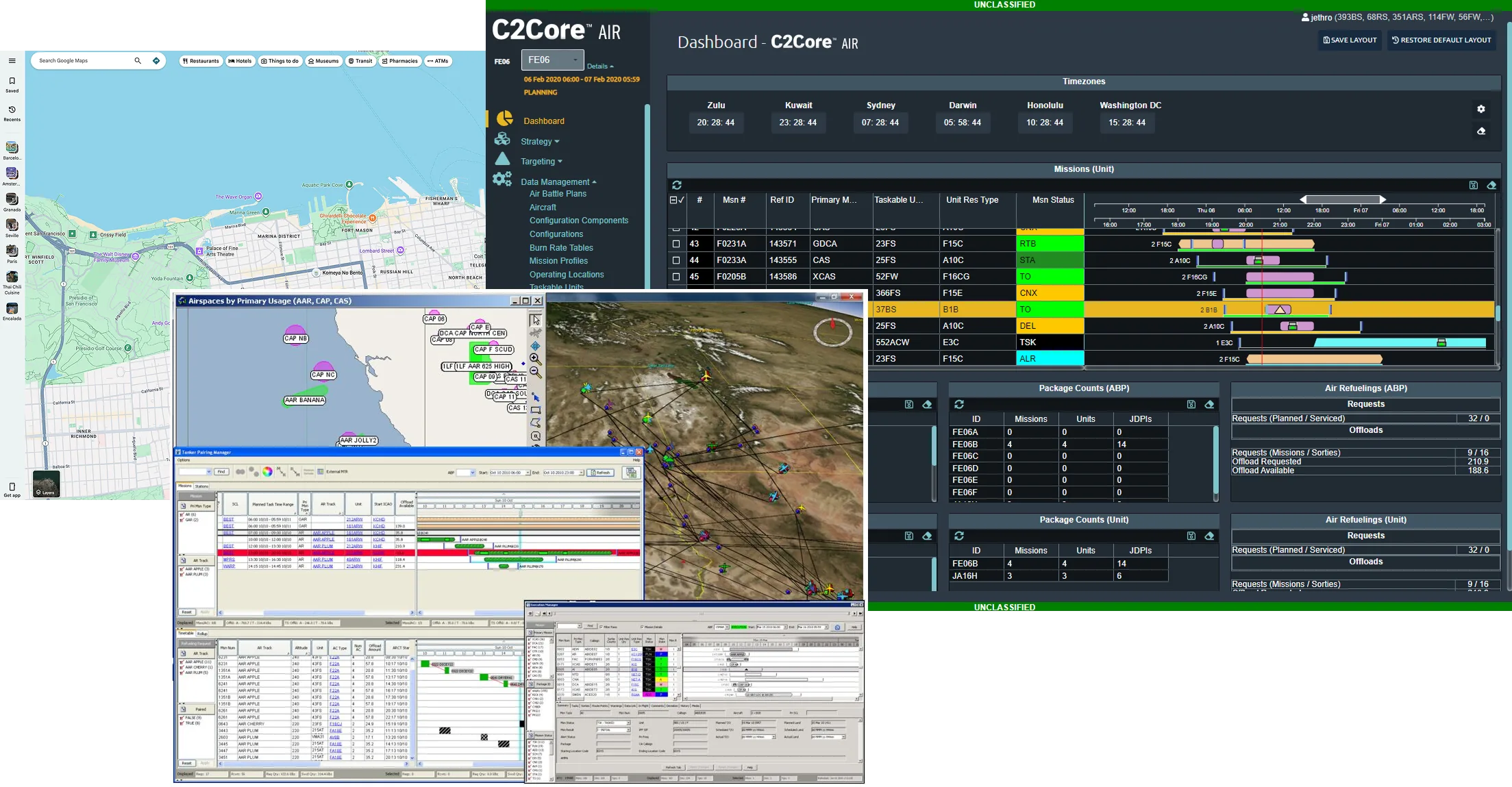
For competitive analysis, I looked at the tools already in planners' workflows: legacy systems like C2Core/MAAPTK, SkyVector (an aerospace map) and Spacer (airspace management). We watched planners open the public SkyVector to measure distances by hand, all to answer one question: can this tanker make this round trip? For simpler patterns, I studied consumer map apps like Google Maps and AllTrails.
Designing the Map View
01Open the map from the mission
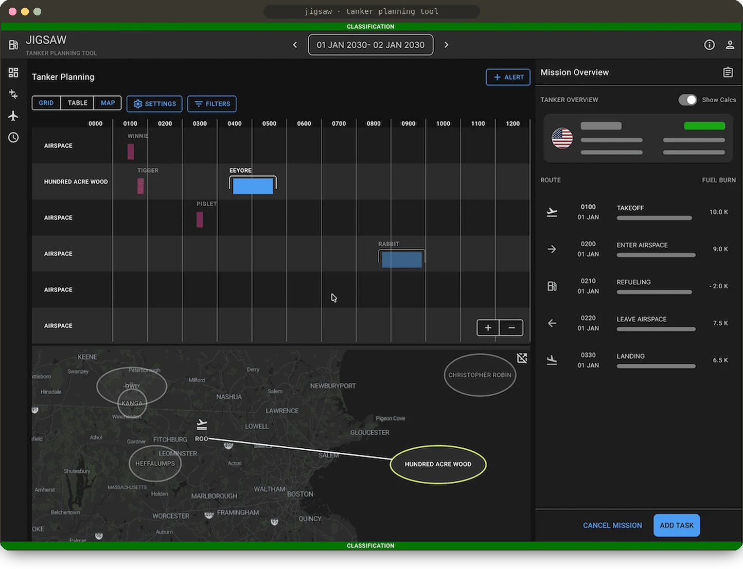
For security reasons, Jigsaw runs on desktops, not mobile, so I designed the Map View as a pane that opens from the table and grid views planners already use. Clicking a tanker puck (our UI term for a tanker in the table) fills the map with that tanker's routes and airspaces. Seeing the estimated route and the borders and airspaces it crosses was the most critical missing piece, and it showed planners right away whether a route needed changing.
02Waypoints, borrowed from the maps people already know
Routes are rarely straight lines. Some areas have to be avoided because of threat levels or required diplomatic clearance, so once routes were visible, planners needed to reshape them. Waypoints were the most detailed UX element on the map. I based adding them on Google Maps' drag-to-reroute pattern, and borrowed from AllTrails for overlapping routes, which are common on out-and-back flights, so planners could always tell which leg they were editing. Planners can update waypoints on the map or in the side drawer.

03Fuel math planners can check at a glance
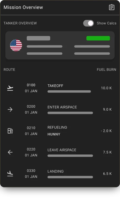
Planners didn't trust Jigsaw's fuel calculations, so they redid them by hand, which broke down under heavy demand. I redesigned the side drawer's timeline to list the route in flight order, with fuel burn at every step, and to update in real time as planners change the map. Seeing the route next to its numbers let them check the math visually. Watching the fuel change as they moved a waypoint built confidence, so they no longer needed outside tools to verify it.
Used by every Jigsaw planner
The Map View is now used by every airman who plans missions in Jigsaw. Planners can drill down from a huge volume of aircraft, tanker and airspace data to a single tanker mission and confirm it can serve every refueling request along its route, without context-switching to SkyVector or measuring by hand.
Much of the process and results are classified, but publicly, Jigsaw's features have saved the Air Force millions of pounds of fuel, at more than $1 million a week.